Visual marketing design trends are evolving more rapidly than ever, thanks to a highly interconnected media culture that provides nearly instant feedback. Sometimes, that feedback is good, and other times, not so much. As a result, designers and marketers are constantly experimenting with new aesthetics to create content that resonates with audiences and keeps them engaged long enough to turn them into loyal brand advocates.
Staying on top of the latest visual marketing design trends is essential for building an enduring brand, telling engaging stories, and emotionally connecting with customers. With that lofty objective in mind, here are a few of the top visual marketing trends that will continue to drive decision-making for marketers and designers.
2024 Visual Marketing Design Trends You Need to Know About
1. Nostalgia Marketing Visuals
Life in the 2020s can be pretty hectic, so it’s no surprise there’s an increasing craving for comfort and nostalgia in strategic visuals that resonate deeply with people. This trend is not merely about revisiting the past but fostering a sense of connection and reassurance amid change. Brands infuse memories and warmth into their present visuals to offer that comfort.
Vintage aesthetics and warm color palettes are more than just retro; they embody timelessness and authenticity, offering solace in the impersonal digital era. These elements, from soothing amber and sepia to earthy tones, create a comforting sense of familiarity, transforming the past into a welcoming home.
Familiar imagery acts as a bridge between the past and present, not solely for nostalgia’s sake but to communicate universality, durability, and trust. By weaving these images into their marketing, brands forge deeper emotional connections, ensuring their messages are not only seen but profoundly felt.
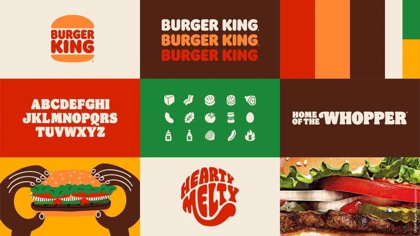
Example: Burger King Revives Its Iconic Logo
A few years have passed since Burger King revealed the retro redesign of its instantly recognizable logo, but in retrospect, the celebrated revival was on the leading edge of nostalgic visual marketing trends. Ditching the cartoonish logo and stylings used since the company’s 1999 rebrand, the new brand identity leans hard into the warm palettes and comforting aesthetics of a timeless past.

Image by Burger King
2. AI-Generated Imagery
As we venture further into the 21st century, the realms of artificial intelligence (AI) continue to expand, now revolutionizing how marketers create strategic visuals. The rise of AI-powered tools in the marketing sphere marks a significant shift, opening up a world where the creation of stunning, compelling imagery is not only faster but also more personalized and innovative than ever before.
AI-generated content transcends merely meeting the demand for new visuals; it revolutionizes creative production by quickly generating high-quality, detailed images. This shift reduces what once took hours to minutes without compromising quality, ensuring outputs meet or exceed expectations with precision.
Personalization is another benefit of AI, enabling content to be customized to individual preferences or demographics. This allows for visuals that deeply resonate with various audience segments, significantly enhancing engagement and fostering a closer connection to the brand.
Example: Coca-Cola Looks Ahead to the Year 3000
Coca-Cola has become a leading brand when it comes to leveraging the power of AI for their present and future visual marketing efforts. The company has not only used AI to create multiple iterations of classic Coke ad campaigns with the “Create Real Magic” platform, but it even launched a brand new soda called Y3000 that was created through collaboration between humans and AI.

Image by Coca-Cola
3. Human-Centered Design
Human-centered design prioritizes the user’s needs, experiences, and well-being above all else, ensuring that every visual marketing design decision is made with the end user in mind. It’s a philosophy that champions empathy, accessibility, and inclusivity, aiming to create strategic visual content that is both engaging and deeply resonant with a broad audience.
Human-centered design ensures visuals are aesthetically pleasing, navigable, and understandable for all, including those with differing abilities. This involves considerations like color contrast for visual impairments, text alternatives for images, and easy-to-navigate interactive elements for users with limited mobility.
Inclusivity broadens this approach, making sure visuals represent the diversity of the target audience, including various cultures, ethnicities, genders, ages, and body types. Embracing diversity in visuals helps brands build a sense of belonging and connection, showing appreciation and understanding of our diverse world.
Example: Airbnb Puts Customers at the Heart of the Story
Airbnb has long been a trailblazer when it comes to human-centric marketing. From a visual marketing design standpoint, the company’s website offers a simple, intuitive interface that allows people to find their perfect destination quickly. The real stars, however, are the high-quality photos that help visitors picture themselves in those destinations, which is why Airbnb provides every listing with access to a professional photographer rather than relying on user-generated photos.
:max_bytes(150000):strip_icc():format(webp)/TAL-airbnb-room-views-AIRBNBTOOLS0523-401ccf20f2274f9393b5b3a337bc5fbb.jpg)
Image by Airbnb
4. Maximalist Visual Marketing Design
Maximalism, a vibrant and bold trend, contrasts sharply with recent minimalist design philosophies, celebrating sensory richness and immersive experiences. It champions a vibrant, layered, and textured design approach, encouraging an embrace of abundance over restraint.
Characterized by vibrant colors, intricate patterns, and rich textures, maximalist design defies “less is more,” opting instead for statement-making chaos and complexity. This method aims to create lively, dynamic spaces and experiences bursting with personality.
In visual marketing, maximalism enables brands to capture attention in a crowded space, offering memorable and eye-catching content. It communicates luxury, creativity, and boldness, engaging consumers emotionally with its exuberant design.
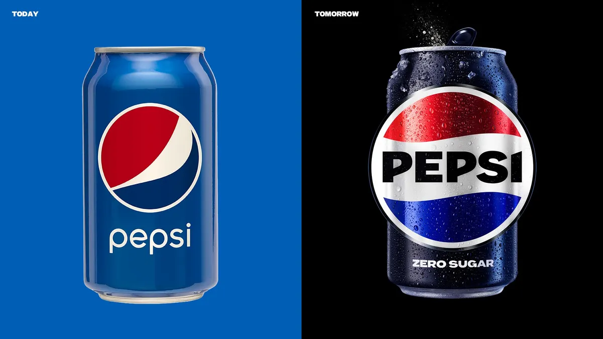
Example: Pepsi Goes Big and Bold
When Pepsi made the decision to update its logo in 2023, the company eschewed minimalist trends in favor of a big, bold design that’s impossible to ignore. The new branding puts the company’s name front and center while also adopting a strong, all-caps typeface that’s impossible to ignore. As the first change to the company’s look in 14 years, it’s a strong shift that conveys Pepsi’s confidence in its future.
 Image by Pepsi
5. Minimalism Design Aesthetic
Just because maximalism is growing in popularity doesn’t mean minimalism isn’t still going strong! Minimalist design focuses on clean lines, white space, and simplicity, offering a calming alternative to the complexity of maximalism.
More than an aesthetic choice, minimalism conveys a brand’s essence with precision and restraint. It emphasizes quality and value through careful selection and detail, ensuring every element has a purpose. By projecting confidence and thoughtfulness, this approach often resonates with consumers on a deeper level.
Minimalism brings calm and focus, with its clean aesthetics reducing cognitive overload and enhancing message clarity. This simplicity improves user experience, from website navigation to product interaction, making minimalism not just a design choice but a strategic one for clear, impactful communication.
Example: Western Union Opts for Standout Simplicity
Western Union may be one of the oldest companies around, but its new branding is anything but stale. Casting aside the busy, often cluttered aesthetic of its previous logos, the company debuted a clean, simple design in 2023 that’s both familiar and strikingly fresh. The versatile branding accomplishes the daunting task of making an over-170-year-old company feel vibrant and relevant for customers of all ages.

Image by Western Union
Staying abreast of visual marketing design trends is no longer optional for today’s marketers. The digital landscape is constantly evolving to shape consumer perceptions and preferences, so understanding and integrating these changes into content is essential for building strategies that grab and hold the viewer’s attention. By keeping a pulse on the latest visual marketing trends, marketers can craft campaigns that forge deeper connections with their audience, ensuring their messages are not just seen but truly felt.
Ask The Content Strategist: FAQs about visual marketing design trends
Q: How do I effectively track and adapt to rapidly changing visual marketing trends to ensure my content remains fresh and engaging?
You can stay current with visual trends by consistently monitoring design publications, social media, and industry leaders, and by using analytics to gauge audience engagement with different visual styles.
Q: What are the specific challenges or pitfalls I might face when trying to incorporate AI-generated imagery into campaigns, and how should they be addressed?
The main challenges include ensuring AI-generated imagery aligns with your brand identity and navigating ethical concerns around authenticity. You can address these issues through clear brand guidelines and transparency with audiences.
Q: Regarding human-centered design, how do I measure the effectiveness of promoting accessibility and inclusivity within my marketing visuals?
You can assess the impact of human-centered design by soliciting feedback from users with diverse needs and analyzing engagement metrics to see how accessibility improvements affect user experience.
Q: If I’m interested in adopting a maximalist design strategy, what considerations should I keep in mind to ensure my marketing visuals are impactful without being overwhelming?
When embracing maximalism, you should always make sure your design maintains a cohesive narrative and balances boldness with clarity to avoid overwhelming your audience.
Q: With the continued relevance of minimalism alongside the rise of maximalism, how can I decide which approach best aligns with my brand’s identity and audience preferences?
You should consider your brand’s core values and audience demographics when choosing between minimalism and maximalism. If the answer isn’t immediately clear, you can leverage A/B testing to determine which approach resonates more effectively.
Subscribe to The Content Strategist newsletter to find out how successful marketers are leveraging the latest visual trends in their campaigns and their future visual marketing plans.
The post Top 5 Visual Marketing Design Trends Shaping Marketing Strategies appeared first on Contently.